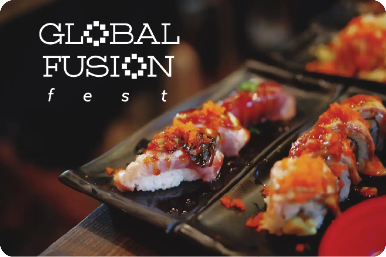
The concept is spicying up the world with squares in the colours of the country flags. The original branding provides the modern and multicultural aspects I was looking for but lacks strength, and the abstract and literal parts did not work well together. It was also hard to apply effectively in some applications.
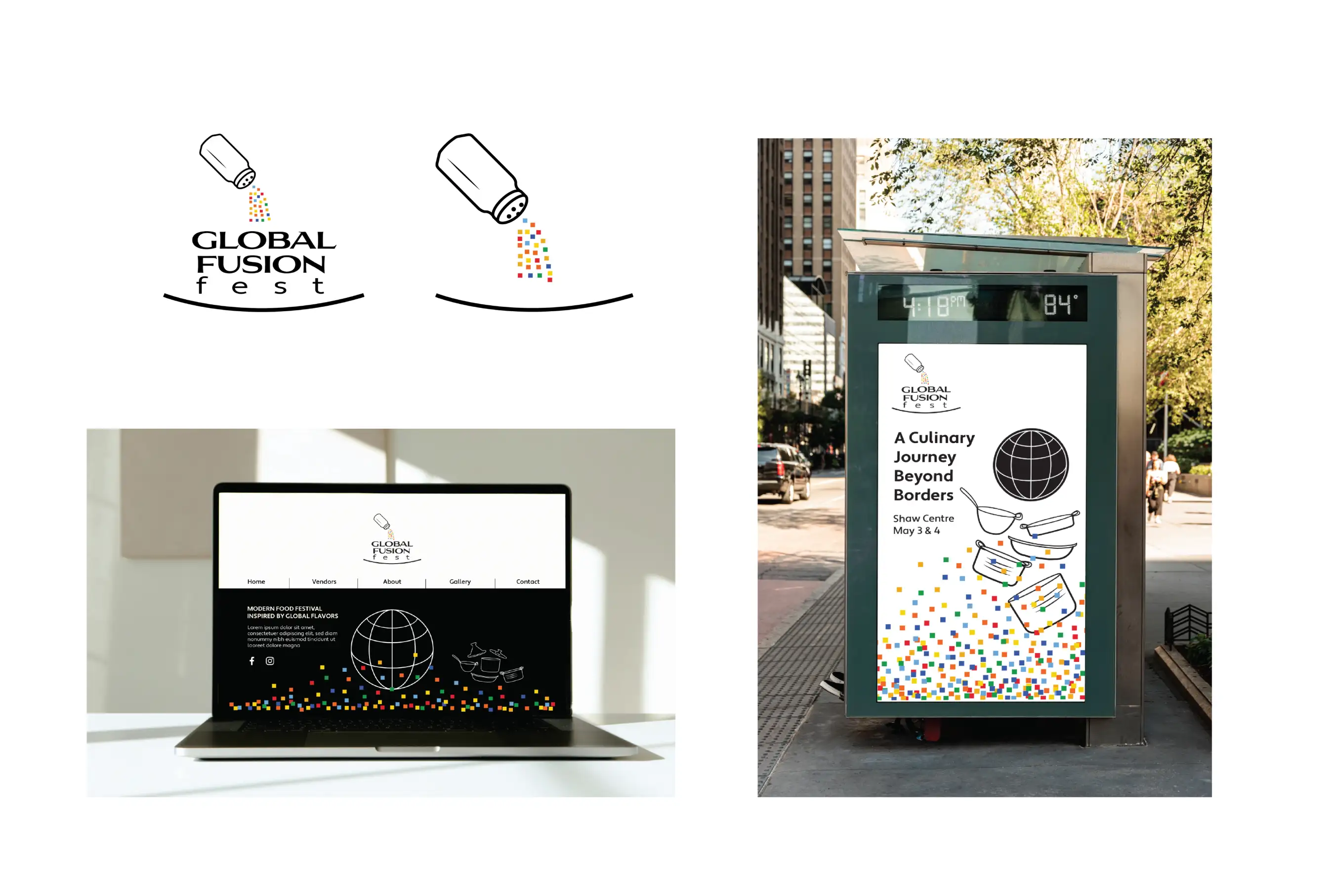
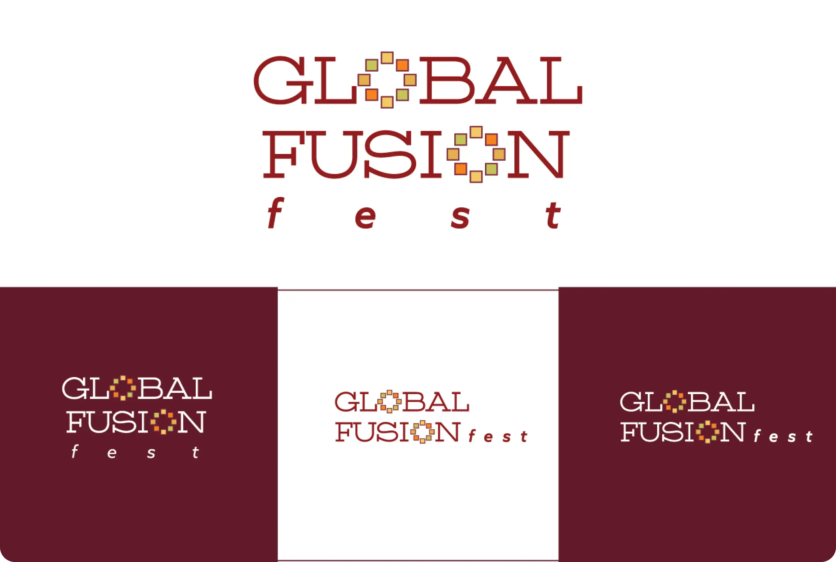
The original concept of spicying up the world is retained using the colours of spices. The typeface Funnel Display was chosen for its modern but playful characteristics, along with the square serifs in the bold version.

The logo employs the square motif to form the two O's within Global Fusion Fest. Both stacked and horizontal versions are created.
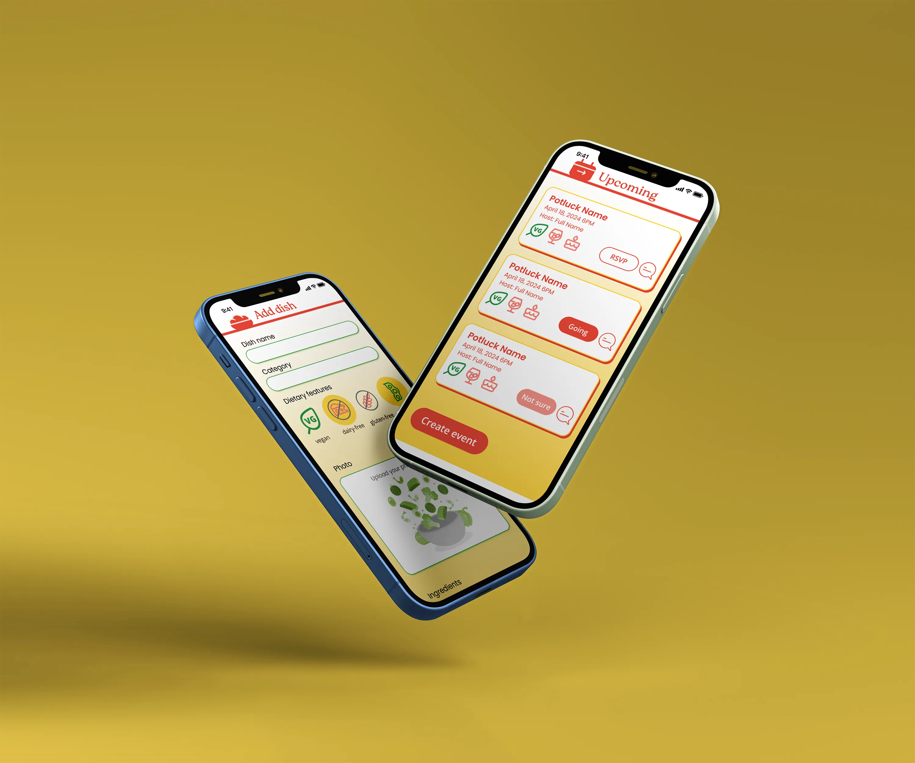
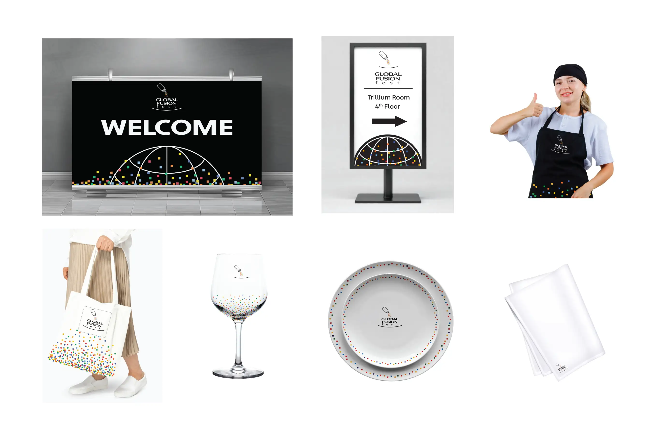
A series of applications takes the participant from event discovery and ticketing to the actual event and souvenirs post-event.
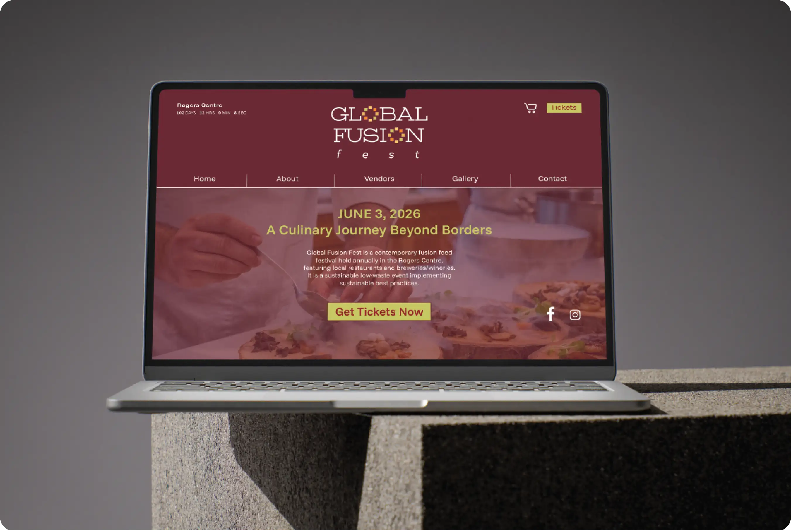
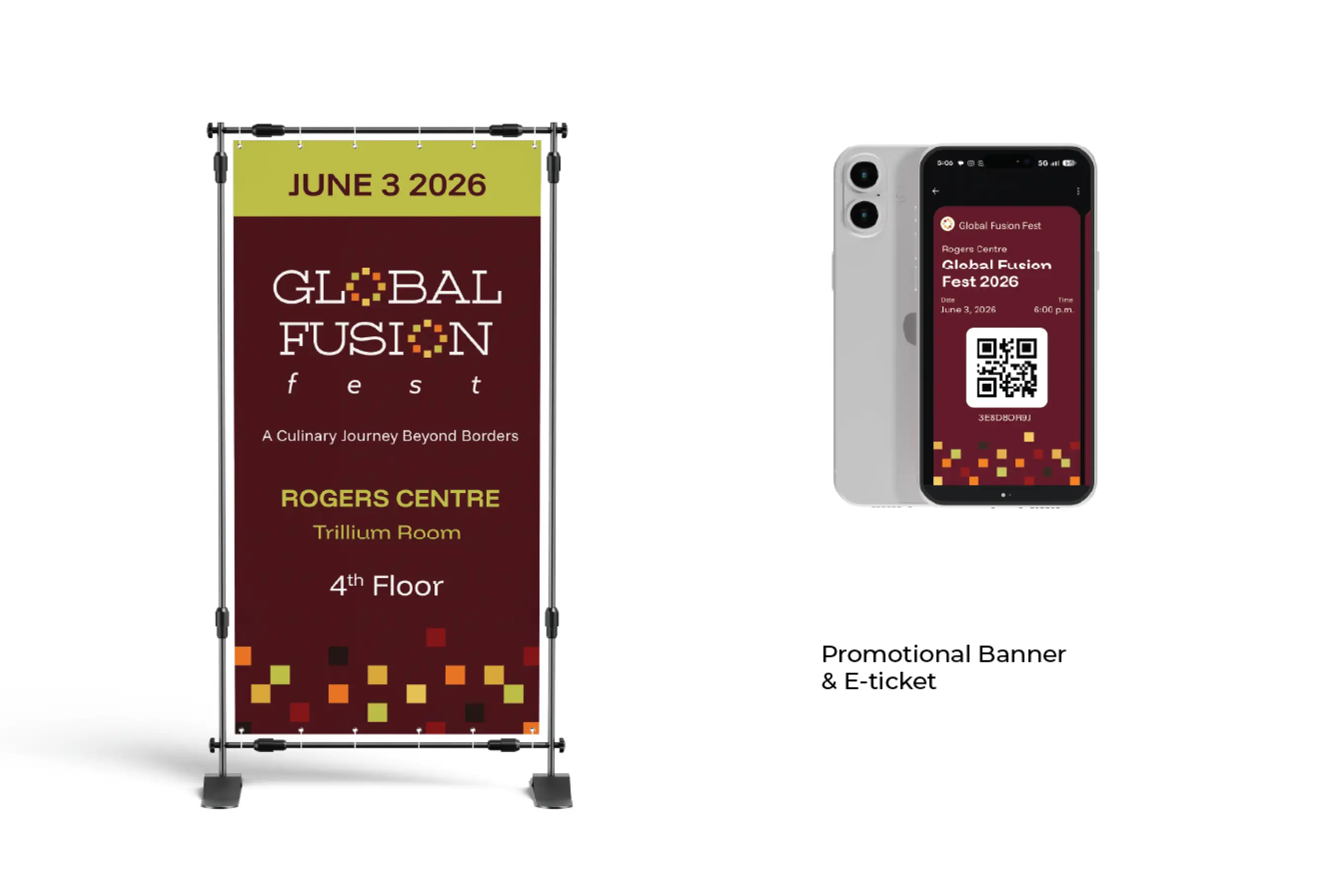
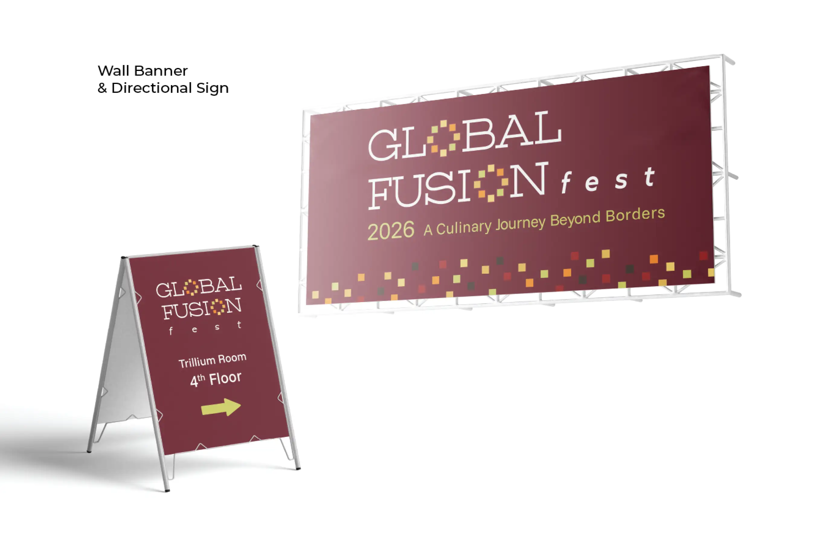

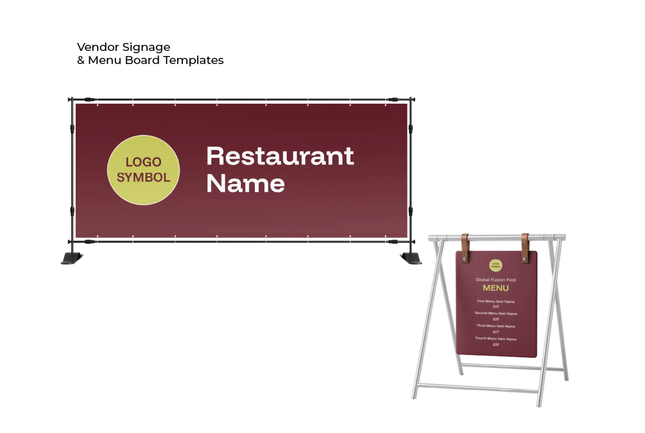
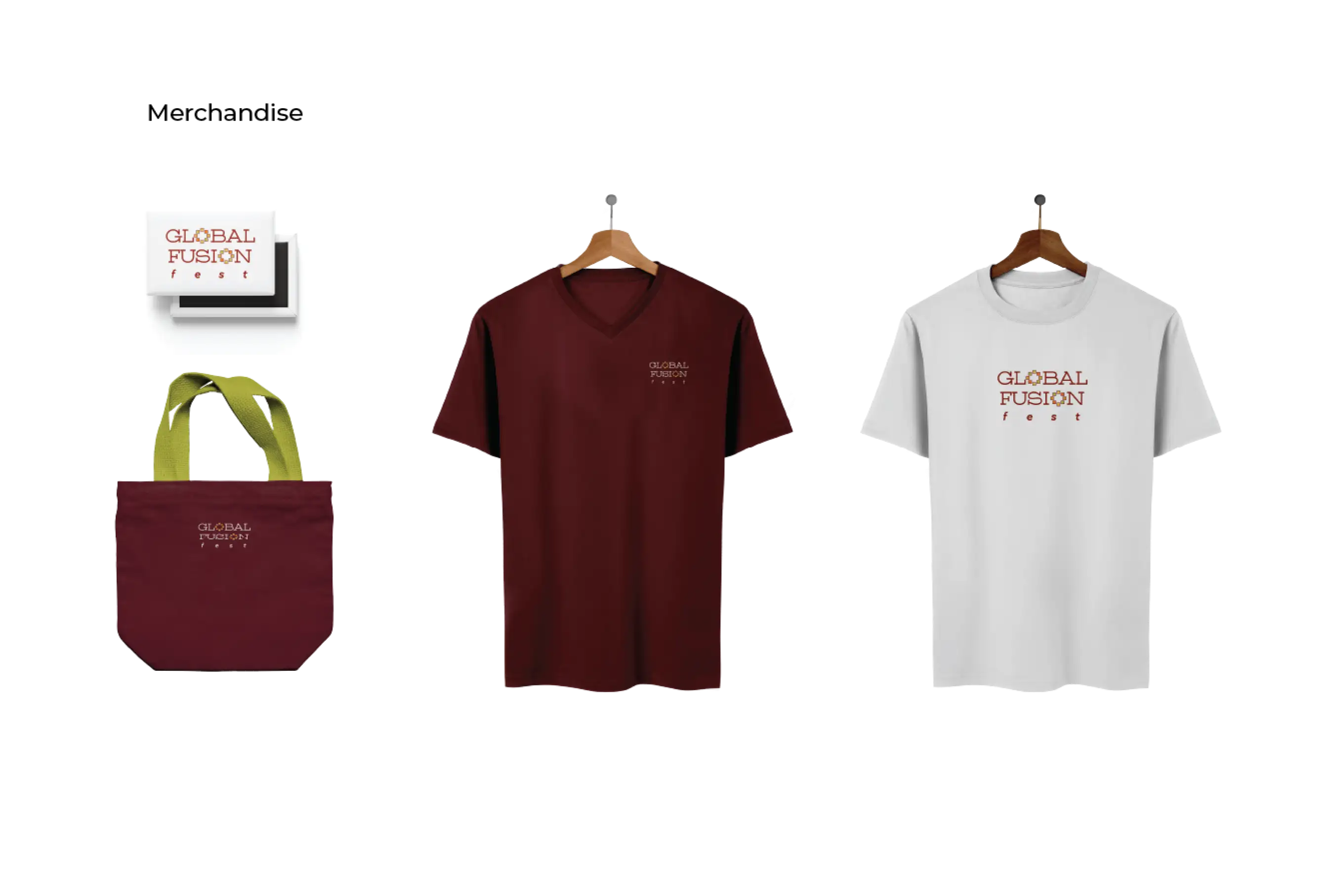
The festival has a clean and modern identity that incorporates ethnic themes. The application across touchpoints ensures a unified brand experience through the entire festival. The identity system makes space for vendor branding within the larger system ensuring overall consistency.